hoda rahimian

UniVoIP Dashboard Redesign: Bringing Clarity to Communications Management
UniVoIP, an established VoIP platform with many years of operation, had grown organically over time, leading to an extensive yet somewhat fragmented user experience. The initial platform had evolved without a specific overarching design strategy, resulting in a complex interface
where users often struggled to gain a quick overview of their critical information. The primary challenge was the “chaos” of an over-extended platform, making it difficult for users to see “what’s going on at a
glance.
Project Overview
The strategic decision was made to refine the platform’s design & user experience, starting with the
introduction of a comprehensive dashboard. This dashboard was conceived to provide a summary of
current information, reduce cognitive load, & allow users to immediately grasp key insights.
Recognizing the potential for user apprehension with sudden drastic changes, the redesign was
approached iteratively, ensuring that enhancements were introduced step-by-step to avoid “freaking
out” our loyal user base.
The Challenge: Navigating the Extended Platform's Complexity
The UniVoIP platform, while powerful, presented several user experience challenges that hindered efficiency & user satisfaction. Our discovery phase identified critical issues, including:
- Minimizing Clicks & Navigation: Users often had to navigate through multiple screens to find specific information or perform common tasks, leading to an increased “amount of clicking between screens.
- Inconsistent Experience: A lack of consistent design patterns & terminology across different modules contributed to a steeper learning curve & user frustration.
- Information Overload: The sheer volume of features & data, without a consolidated view, made it difficult for users to prioritize & act on critical information.
- Limited Customization & Control: Specific feedback highlighted the need for more granular access control & flexibility in data presentation.
- Pain Points in Core Functionality: Specific operational issues, such as inbound/outbound FAX errors due to transcoding, the inability to easily disable tenants, & the need for richer call log details, pointed to areas where the platform’s utility was hampered.
These challenges underscored the need for a solution that could centralize essential information, streamline workflows, & provide a clearer, more consistent user experience without disrupting established routines.
Design Process: A User-Centered, Iterative Journey
Our approach to redesigning the UniVoIP platform, starting with the dashboard, was deeply rooted in user-centered design principles & a strategic iterative rollout to manage change effectively.
1. Discovery & Research Phase
This foundational phase involved extensive data collection & analysis to thoroughly understand user
needs, business objectives, & existing pain points.
Stakeholder Interviews:
In-depth interviews were conducted with key internal stakeholders, including the marketing team, to gather diverse perspectives on platform priorities, operational challenges, & strategic goals. These interviews highlighted “project expectations” like “overall
consistency,” “ease of use,” & “general improvement.” They also revealed business priorities, risks associated with changes, & insights into existing technical limitations & user behaviors.
Heuristic Evaluation
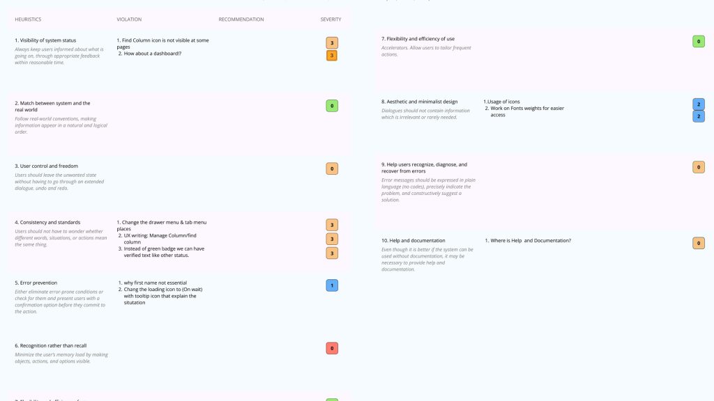
A comprehensive heuristic evaluation of the current platform identified numerous usability violations.
Key findings included:
– issues with the “visibility of system status” (e.g., no location selected on ‘Assign Phone Number’ page),
– “match between system and the real world,”
– “consistency & standards,”
– “error prevention,”
– “help & documentation.”
This evaluation provided a structured framework for identifying core usability challenges that the dashboard could mitigate.
User Feedback Collection
User feedback, particularly from the marketing team, was crucial. This included detailed JIRA tickets outlining specific issues & feature requests.

Affinity Diagramming
All collected data from heuristic evaluations, stakeholder interviews, & user feedback was synthesized using affinity diagrams. This process helped identify recurring themes, prioritize user needs, & group related insights into actionable design opportunities.
2. Definition & Ideation Phase
This phase focused on defining the core requirements & conceptualizing solutions.
Information Architecture & User Flows
Based on the insights from discovery, the information architecture was re-evaluated, and initial user flows were mapped out. The goal was to rationalize the existing complex navigation & identify how a new dashboard page could integrate seamlessly into the current structure, serving as a central hub.
Ideation Workshops
Cross-functional ideation workshops were conducted to generate a wide range of design concepts for the dashboard. The focus was on “essential diagrams” and data visualization that could convey complex information concisely.
Feature Prioritization
Recognizing the need for an iterative approach, features for the dashboard were carefully prioritized. The “Summary” board highlighted the ‘Dashboard’ as a key ‘Area’, with the ‘Numbers’ & ‘Management’ applications being of primary importance. This phase balanced immediate user value with the long-term vision for platform refinement.
3. Prototyping & Validation Phase
This phase translated ideas into tangible designs & validated them with users.
Wireframing
Low-fidelity wireframes were created to outline the layout, structure, & key elements of the dashboard. This helped visualize the information hierarchy and basic interactions.
Prototyping
Interactive prototypes were developed, allowing stakeholders & users to experience the proposed dashboard functionality before development. This was critical for gathering early feedback & making necessary adjustments.
Usability Testing
Prototypes were subjected to usability testing with both new and existing users. The feedback from these sessions directly informed design iterations, ensuring the dashboard was intuitive, efficient, & met user expectations. This iterative testing was crucial for ensuring user acceptance during the phased rollout.
Solution: The Intelligent UniVoIP Dashboard
The culmination of this iterative design process was the introduction of a new, intelligent dashboard for the UniVoIP platform. Designed as a personalized control center, it empowers users with immediate access to critical information & streamlined navigation.
Key features & design decisions of the dashboard include:
At-a-Glance Overview
The dashboard prominently features essential diagrams & data visualizations that provide a quick summary of current information, such as call volumes, service status, or account health, directly addressing the “chaos” problem.
Personalized Information
Designed to surface the most relevant data to each user based on their role & preferences, reducing the need to dig through menus.
Actionable Insights
Diagrams & data points are designed not just to inform but to prompt action, with clear pathways to deeper dives or related functionalities.
Streamlined Navigation
Acting as a central hub, the dashboard provides quick links & contextual navigation to frequently accessed areas like ‘Numbers’, ‘Service Control’, &
‘OfficeConnect’, directly addressing the need to “minimize clicks.”
Iterative Design for User Adoption
The dashboard was introduced as the first major step in the platform’s redesign, allowing users to gradually adapt to the improved experience. This cautious approach was a direct response to the need to “not freak out” users with sudden, drastic changes.
Conclusion
As Head of Product Design, leading the UniVoIP dashboard initiative was a strategic step towards re-establishing clarity & efficiency within a rapidly expanding platform. Through a rigorous process of heuristic evaluation, stakeholder engagement, user feedback analysis, & iterative prototyping, we delivered a solution that not only solved critical usability challenges but also set a new standard for user experience. This project underscores the power of a thoughtful, user-centered design approach in transforming complex systems into intuitive & indispensable tools, ultimately empowering our users & strengthening UniVoIP’s position in the market.
hoda rahimian is proudly powered by WordPress